《1. Introduction》
1. Introduction
A reliable electric grid is crucial to the operation of our modern society. Most of the time, electric energy is seamlessly ubiquitous; easily available from the electric outlets that represent the definition of plug-and-play convenience. Yet these outlets are also the gateway to some of the world’s largest and most complex machines. Central station electricity got its start in the early 1880s with direct current (DC) systems operating at just 100 V and serving a handful of customers. Over the next century, interconnected electric grids rapidly developed to span countries and sometimes continents with transmission-level voltages up to 1000 kV. Selected by the US National Academy of Engineering as the top technology of the 20th century [1], electrification has changed the world!
However, the grid that developed in the 20th century needs to continue to evolve to meet our new needs as we move forward. This evolution includes the requirements to integrate potentially large amounts of intermittent generation resources such as wind and solar photovoltaics (PVs), and to satisfy the desires of customers for even greater reliability and flexibility. To meet these requirements, the sensing, communication, and computational capabilities of the grid are being rapidly expanded, with these changes generically considered to be part of the “smart grid.”
The smart grid is clearly making the grid more intelligent, with much more sensing and embedded automatic control. This intelligence is certainly beneficial, but it also makes the grid even more complex, creating the need for continually improved tools to help humans, who are still very much “in-the-loop,” design and operate the smart grid of tomorrow. Over the years, much has been done in power system visualization and analytics with Ref. [2] providing a useful summary circa 2009. The goal of this paper is to provide an overview of power system visualization, touching on both classic techniques that are now widely used in industry and some newer advances that will help the smart grid move forward. In particular, the paper focuses on wide-area visualization, in which the goal is to provide a unified understanding of a large-scale system.
《2. Overview of electric grid operations and how the grid can fail》
2. Overview of electric grid operations and how the grid can fail
First, it is helpful to briefly describe how the grid operates, and how it can fail. Any electric grid has three major components: the generation that creates the electric energy, the load that consumes it, and the wires that move the electricity from the generators to the load. The wires are typically divided into two groups, the transmission system, typically operating at voltages above 100 kV, and the distribution system operating at voltages below 100 kV. The highest transmission voltages are 1000 kV in China and 765 kV in North America. The transmission system is usually networked, which provides for greater reliability by providing multiple paths to each bus (node). In contrast, the distribution system is often radial so that a failure of any component can result in a localized blackout. The electrical equipment at a particular geographic location, including the buses, is called a substation. All large-scale grids are alternating current (AC), with 60 Hz used in North America and parts of South America, and 50 Hz in most of the rest of the world. The high-voltage grid is also three-phase, which allows twice as much electricity to be transported for the same amount of wire compared to a single-phase system; single-phase is usually only used at the low voltages (<600 V) supplied to end-use customers.
In an interconnected AC grid, all of the generators operate in synchronism (or phase) with one another, meaning that on average they have exactly the same electrical frequency. In North America, there are four major AC interconnections (the Eastern Interconnect (EI), Western Electricity Coordinating Council (WECC), Electric Reliability Council of Texas (ERCOT), and Quebec), whereas there are two in China (the State Grid Corporation of China (SGCC) and the China Southern Power Grid (CSG)). Large-scale interconnections provide two primary benefits: reliability and economics [3]. Since an interconnection can have thousands of generators, reliability is greatly improved because even if the largest generators fail, the lights stay on. From an economic perspective, grid participants can trade electricity anywhere within an interconnection, taking advantage of lower cost generation that may be 1000 km distant. Because the grids operate at high voltages, the total transmission-level losses are usually rather modest, perhaps 3% for the North American EI and 4% for the less dense WECC. Electricity cannot be directly transmitted in AC form between different interconnections. However, such transactions are possible by first converting it to DC, and then inverting it back to AC. These transactions can be done for long-distance power transmission using high-voltage DC (HVDC) lines or at interconnection boundary points using AC-DC-AC conversion.
A key complexity associated with power systems is the wide range of time scales that need to be considered, both operationally and in the development of models, algorithms, and their subsequent visualization. Figure 1 shows some of the key values [4]. For this paper’s wide-area visualization focus, the most important time scales are the power flow (quasi-steady-state) and the shorter transient stability. The power flow time frame is how the grid would be perceived if observed in an electric utility control center. That is, while the grid itself is operating at 50 Hz or 60 Hz, the average power flowing on the lines would usually be changing almost imperceptibly slowly in response to the changing system load and generation.
《Fig. 1》
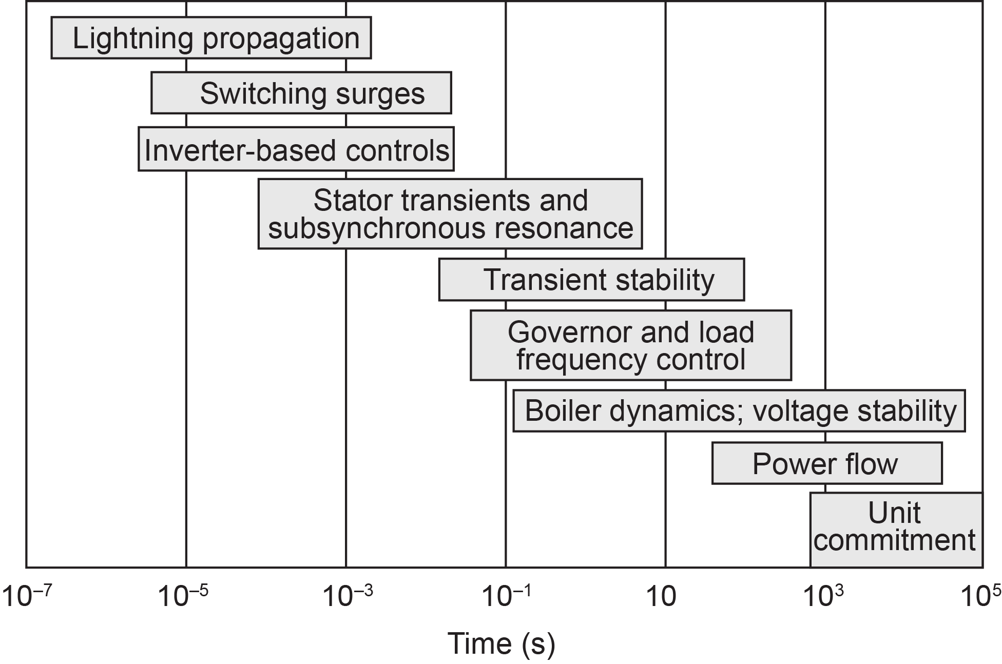
Fig.1 Power system operations time scales.
Power flow time scale models come in all different sizes, with 65 000 bus models used to represent the EI in planning studies, and models with potentially tens of thousands of buses in control-center environments. However, to introduce the visualization concepts, it is useful to start with smaller, academic models. Figure 2 shows a visualization of a fictitious seven-bus system using what is known as a “oneline diagram” (or a “oneline”). In a oneline, the actual three-phase devices, such as transmission lines and generators, are shown using a single line. The buses are shown using thicker bars, generators with black circles, the aggregate loads with black pointed lines, and the transmission lines with the thinner lines. The real and reactive power flows are shown for all devices, with the green arrows used to visualize the flow of the real power [5]. As a consequence of Kirchhoff’s current law (KCL), at each bus the net real and reactive power must match the generation minus the load at the bus; this is readily verified in the figure. As is common in engineering studies, the voltage magnitudes are shown in per unit (pu), in which the actual voltages are normalized by their nominal values. So in the Figure 2 system, which models a nominal 138 kV system, a pu value of 1.04 corresponds to 143.5 kV. The pie charts on the lines are used to visualize the percent loading in terms of a maximum current limit. These limits are often due to thermal constraints, recognizing that the losses in a wire vary with the square of its current.
《Fig. 2》
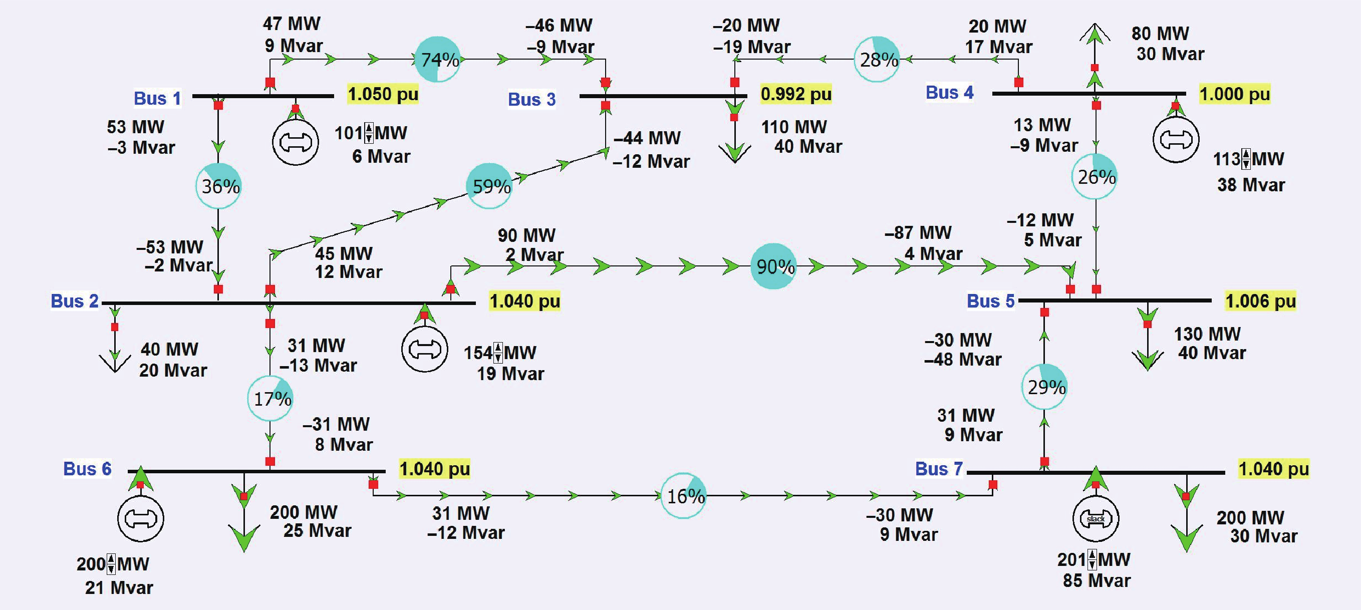
Fig.2 A seven-bus system oneline visualization.
The basics of normal grid operation can be thought of as slowly changing power flow solutions based upon the variation in the load, and on manual or automatic changes to the generator real power outputs and other controls. In order to stay in quasi-steady-state operation, the total generation must be adjusted to match the total load plus losses. Reliable operation requires that none of the transmission lines or transformers be overloaded, and that the bus voltage magnitudes be kept within a range of perhaps 0.94 pu to 1.06 pu. Because the grid is regularly subjected to disturbances, such as a generator failure or the loss of a transmission line, reliable operation is usually further constrained by the need to continue to operate with no limit violations when subject to such contingencies. This is known as N−1 reliability since the system can operate with any single element removed. Figure 3 shows the Figure 2 system with the line between buses 2 and 3 out of service. With two lines now overloaded, this is no longer a reliable operating point. If corrective action is not taken, a single line outage can result in subsequent outages, leading to a cascading blackout, such as what occurred in the North American EI on August 14, 2003 [6].
《Fig. 3》

Fig.3 A seven-bus system visualization after a line outage.
Steady-state visualizations can also be created for extremely wide areas as well. Figure 4 shows an example of an extremely wide-area visualization of a power flow case. Real power load is shown in white and real power generation is shown in magenta for the four major interconnects in North America; data is shown for summer 2015 peak loading conditions.
《Fig. 4》
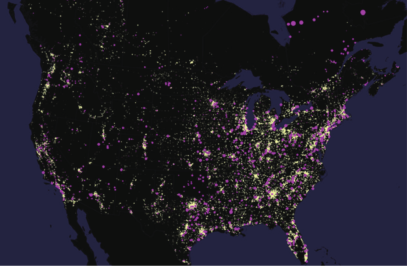
Fig.4 A wide-area visualization of North American power flow data showing electric load (white) and generation (magenta).
It is also important to consider the much faster dynamic response of the power system to a contingency. That is, whether or not, following a contingency, the system can reach the new quasi-steady-state equilibrium indicated by the power flow. The dynamic response of the power grid on time frames ranging from about 0.01 s to approximately 60 s is known as transient stability. As an example, Figure 5 shows the variation in each bus’s frequency for a transient stability simulation of a 16 000 bus, 3300 generator system in which the contingency is the loss of two large generators at 2 s. For this contingency, the system remained stable, although with some large oscillations. By showing the frequency response for all 16 000 buses, the figure does a good job of showing the envelope of the frequency response, but it is impossible to determine the response of any particular bus. Alternative ways of visualizing such time-varying information are covered in Section 4.
《Fig. 5》
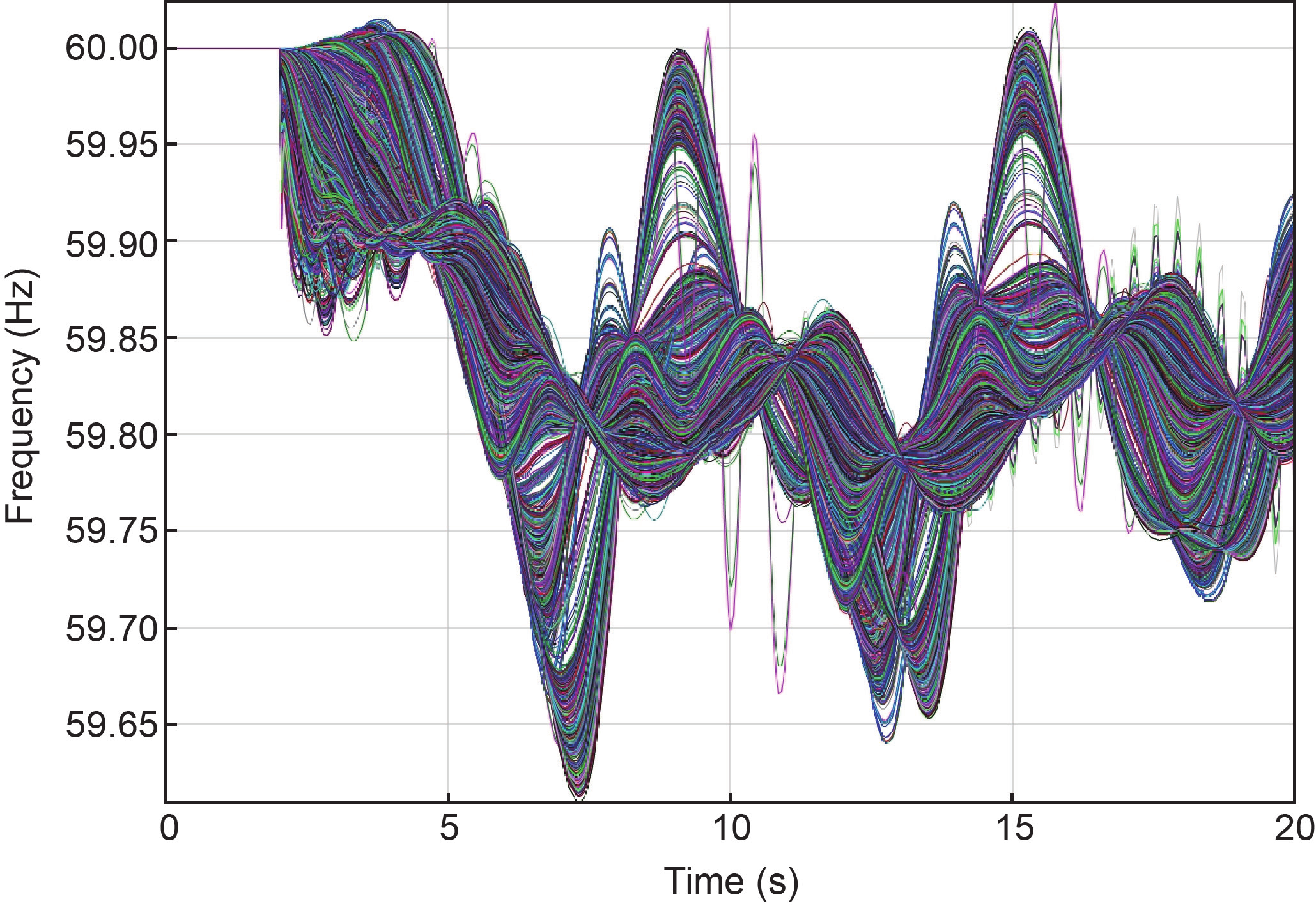
Fig.5 Large system generator frequencies following a generation loss contingency.
Ultimately, what drives power system visualization is data. For engineering studies, this data is provided by power flow and transient stability software applications. Because these applications are model-based, all the desired data is readily available from the software simulation. With the power flow, a single snapshot is provided, whereas transient stability provides time-varying data, such as the data shown in Figure 5, with sample rates of up to several hundred points per second. Key data includes bus voltage magnitudes and angles, transmission line and transformer information (e.g., MW, Mvar, percentage loading), load/generation values, and bus frequency (transient stability only; for power flow, the frequency is assumed to be fixed).
For online visualization, all data is time-varying, and has traditionally been provided by the supervisory control and data acquisition (SCADA) system that usually scans the system every few seconds. While SCADA data has been, and continues to be, quite important in system operations, a disadvantage of this slow scan rate has been the inability to observe transient stability dynamics. Also, SCADA data historically did not include information about the voltage phase angles. In order to estimate the phase angles and hence get a more complete system model, state estimation (SE) is commonly used [7] in which a model of network parameters is combined with the SCADA status and analog measurements in order to obtain (through an iterative solution) what closely resembles a power flow solution. In the best-performing control rooms, SE runs about once per minute and converges more than 98% of the time [8].
A key smart grid development that is vastly augmenting the ability to directly measure, and hence visualize, power system dynamics is the widespread deployment of phase measurement units (PMUs) [9]. PMUs utilize the precise time available from the Global Positioning System (GPS) to determine with reasonable accuracy the magnitudes and phase angles of power system values such as voltage and current, and also the bus frequency. Data rates of 30 or 60 samples per second allow the direct observation of power system dynamics. In North America, PMU deployment and utilization is being coordinated by the North American SynchroPhasor Initiative (NASPI) [10]. The low-cost, GPS-synchronized, 120 V electrical outlet measurements of frequency, phase angle, and voltage magnitude provided by FNET/GridEye are another potential data source for power system visualizations [11].
While the benefits of large, interconnected grids are significant, a detrimental side effect is that if something goes wrong it can rapidly impact a large area. This characteristic is indicated in Figure 6, which summarizes the five general states in which power systems can operate [12]. Most often, the system is in the normal state, in which all the constraints are satisfied. While wide-area visualization is important for the normal state, it becomes even more important in the other states, in which effective operator decisions can have significant impacts.
《Fig. 6》
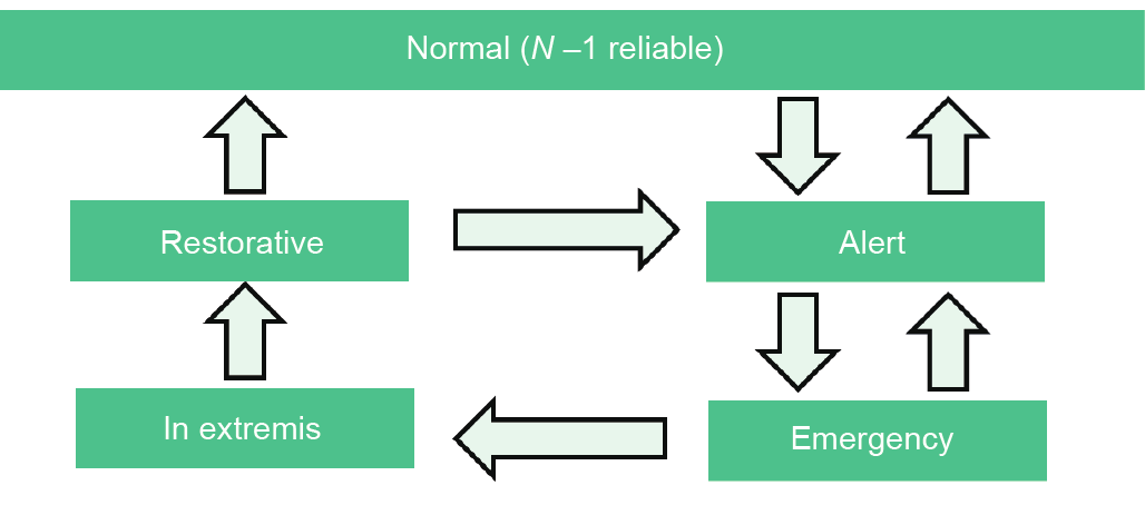
Fig.6 Power system operating states.
Whether operator action can prevent a blackout depends on the time frame and severity of the event. Some large-scale blackouts cannot be prevented by operator action. Earthquakes are examples of unanticipated events that can cause severe damage within seconds. Here, visualization would be most helpful in the restorative state as there is nothing the operator can do to prevent physical damage due to an earthquake. Conversely, slow-moving weather systems such as hurricanes or ice storms give operators plenty of time to act, but the blackouts cannot be fully prevented. As an example, an ice storm in January 1998 in the northeast portion of North America resulted in the collapse of more than 770 transmission towers, causing a large-scale blackout in Canada [13,14]. Another such example is Superstorm Sandy in 2012 in the USA that caused 8.5 million customer power outages with damage estimated at $65 billion [15].
However, many, if not most, potential large-scale blackouts do have time frames that could allow for effective operator intervention. An important example is the August 14, 2003 EI blackout that affected more than 50 million people and played out for over an hour before the final cascade [6]; lack of situational awareness was one of the causes of this event. Other examples include the Italian blackout of September 28, 2003 with a time frame of about 25 min [16], the Indian blackout of July 30, 2012 that affected 700 million people in which the time frame between the first event and the cascade was 2 h [17], and the September 8, 2011 WECC blackout that played out over 11 min and that also included lack of real-time situational awareness as a cause [18]. A primary reason for these time frames is the underlying power system dynamics, including the time constants associated with thermal heating on transmission lines and transformers, the operation of load-tap-changing (LTC) transformers, and of generator over-excitation limiters.
An emerging area of concern that impacts visualization is what the North American Electric Reliability Corporation (NERC) calls high-impact, low-frequency (HILF) events [19]. These are statistically unlikely but still plausible events that, if they were to occur, could have catastrophic consequences on the grid and hence for society. Included are large-scale cyber or physical attacks, pandemics, electromagnetic pulses (EMPs), and geomagnetic disturbances (GMDs). Many have time scales in which effective wide-area visualization could be helpful. For example, a large GMD could have a continental footprint with underlying dynamics ranging from minutes to hours [20].
《3. Transmission system visualization of the present state》
3. Transmission system visualization of the present state
Wide-area power system visualization is crucial in order for operators to respond effectively during disturbances and for planners to have a better understanding of the systems they are designing. This section presents some useful, now widely deployed techniques focusing on snapshot visualizations of the current state of the system, while the following section covers effective visualization of time-varying quantities.
The goal of a wide-area snapshot visualization is to provide pertinent information about the health of the power grid without an unmanageable amount of detail. Such visualizations are particularly important during non-normal operation, since the system state could be quite different from anything that had been previously encountered. For example, the system voltage profile could be quite unusual, line flows might be substantially different from their normal values, and there could be a large number of device outages. Another consideration for the “Emergency” and “In extremis” states from Figure 6 is that the level of control-room personnel stress could be high. While expert operators are more immune from stress than less experienced personnel, the success of experts in decision-making is far from guaranteed. “Cues may be uncorrelated, overconfidence may shortchange cognitive monitoring and rapid pattern-recognition classification may overlook a single outlying cause” [21]. Confirmation bias and overconfidence bias may also be present [21]. Finally, the number of “decision makers” in the control room could be greater during an extreme event, necessitating visualizations that can be seen simultaneously by a team in order to enhance situational awareness and facilitate consensus in decision-making. In a control room, this goal is partially achieved with the use of a mapboard. Figure 7 shows the North American ISO New England control room with its large mapboard.
《Fig. 7》
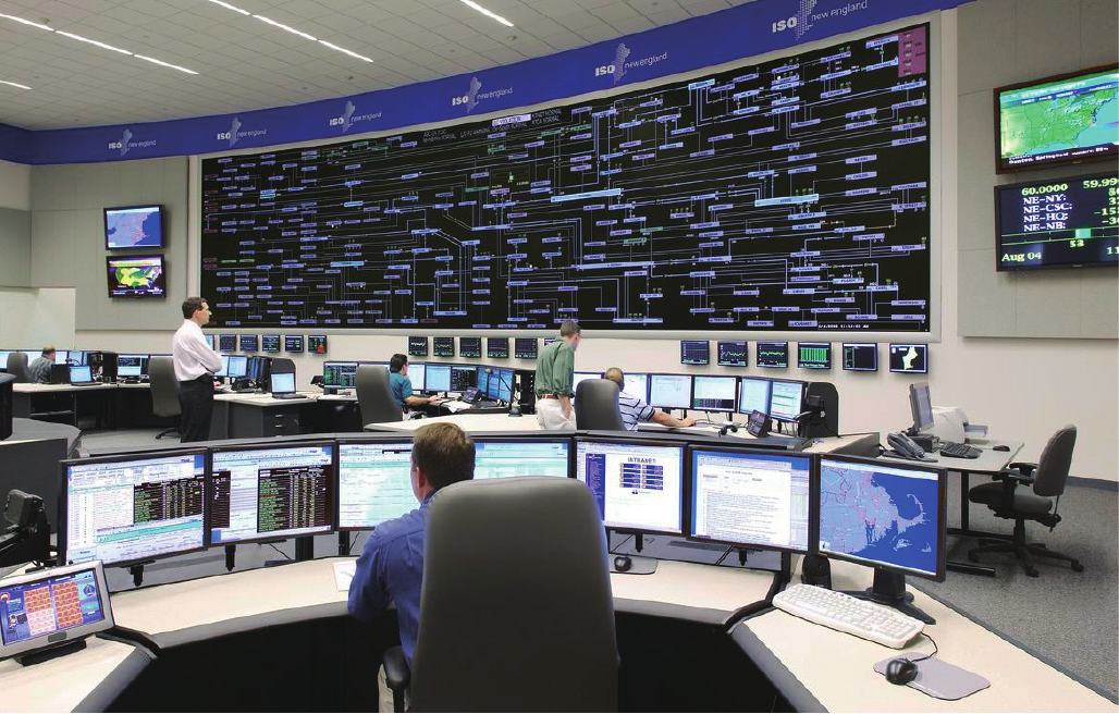
Fig.7 The ISO New England control room. Source ISO New England, Inc. photo.
There are several visualization techniques that are quite helpful in providing overall power system situational awareness. One is an overview system oneline diagram, as shown in the mapboard in Figure 7. There are two common approaches for presenting this information. The first is to draw the display using fairly accurate geographic coordinates. This was the approach used in Figure 4 to show the locations of the electric load and generation. One advantage of this approach is it provides a familiar context for the displays, particularly when communicating with non-experts. A second advantage is that it allows the power system information to be overlaid on other geographic displays, such as weather data or information about other infrastructures. However, a key disadvantage is that the locations of greatest interest electrically, such as substations in high-load-density urban areas, have a small geographic footprint. The alternative is to use a pseudo-geographic layout, in which the display positions have some relationship to their actual geographic position. In this approach, positioning the display elements for clarity is the overriding design consideration. Such an approach is used in the Figure 7 mapboard. Morphed displays, in which elements can be dynamically moved from their actual geographic locations to their pseudo-geographic locations, can also be used.
An overview visualization, such as the mapboard in Figure 7, can provide a summary of the statuses of key substations and lines. Figure 8 shows a zoomed-in view of part of this mapboard [2]. During normal operation, light blue indicates the substations with 345 kV as their highest nominal voltage as well as the 345 kV lines, whereas light gray is used to indicate the 115 kV substations and lines. Different values of line pixel thickness are also used to emphasize the different voltage levels. Transmission line real power flow direction arrows are shown using a slightly darker shade of the color. Each substation rectangle shows on its left side the lowest actual voltage (in kV) for the highest nominal kV bus in the substation. Substation generation is indicated using small brown circles if the generators are online, and dark gray if they are offline. Generator ID numbers, MW outputs, bus kV values, and line flows are also shown on the display using a similarly coordinated color scheme. Another useful technique is for slow-starting generating units to be shown above the substation rectangle, while fast-starting units are shown below. When objects change from normal to alert status, their colors change. An example is drawing a transmission line in bright red with green flow arrows to indicate a short-term emergency limit. Other color changes are used to indicate additional conditions, such as a green line with no arrows for an out-of-service transmission line.
《Fig. 8》
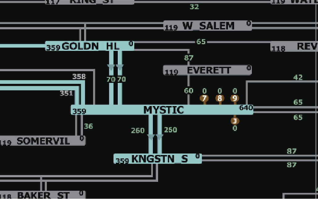
Fig.8 Use of substation summary display objects. Image courtesy of ISO New England, Inc.
A visualization technique that has been shown to be quite useful is the use of dynamically sized pie charts to indicate the percentage of a limit violation. A small system example was shown in Figures 2 and 3. For larger systems, it is often helpful not to show the pie chart unless the line’s loading is above a percentage loading, and then to dynamically increase the size and/or color of the pie chart if the flow is approaching or above a limit. This will cause the information to “pop out,” taking advantage of pre-attentive processing [22] to ease the search for overloaded lines. Examples of features that are pre-attentively processed include size, color, and motion. This technique is demonstrated in Figure 9, which shows pie chart loadings for more than 400 transmission lines and transformers using a oneline in which the 765 kV lines are colored green, the 345 kV lines red, and the 138 kV lines black. Dynamic sizing and coloring is used so that pie charts on lines loaded above 100% of their emergency limit have their size increased by a factor of 12 and are colored red, whereas those on lines loaded between 85% and 100% have their size increased by a factor of 10 and are colored orange. In the figure, the single line loaded above 85% is immediately apparent. Green arrows are again used to visualize the direction and magnitude of the real power flow.
However, there is a tradeoff between making the pie charts large enough to be pre-attentively processed, yet not so large that they produce excessive display clutter. The need for this tradeoff is illustrated in Figure 10, which modifies the Figure 9 system by opening three 345 kV lines; open lines are indicated by pie charts with a green “×” and a black background. The large number of violations makes it difficult to rapidly locate the most important overloads. One solution is to filter the display by blending the lower voltage lines with the background to highlight the more critical 345 kV line violations. This solution is shown in Figure 11. Another approach is to dynamically decrease the amount of resizing that occurs so that as the display is zoomed in, the object overlap eventually vanishes. Finally, since some devices are designed to be normally operated at a high limit percentage, such as generator step-up transformers, different scaling values can be applied to these devices.
《Fig. 9》

Fig.9 A large-scale grid 765/345/138 kV system using dynamically sized pie charts.
《Fig. 10》

Fig.10 A large-scale grid 765/345/138 kV system with a large number of violations.
《Fig. 11》

Fig.11 A large-scale grid 765/345/138 kV system using a filter to emphasize the high-voltage grid.
Another important quantity to visualize is the bus per unit voltage magnitude. For wide-area visualization, the number of values to show is usually too large to effectively use individual text fields. A technique that has proven to be quite useful is color contouring [23]. Contours have, of course, been used extensively in other fields for the display of spatially distributed continuous data, such as temperatures. In order for this technique to be widely adopted for voltage magnitude visualization, several issues needed to be addressed. First, bus voltages are not continuous, but rather occur at individual locations. Second, LTC transformers can introduce discrete changes in the per unit voltage magnitudes. Third, locations that are near one another on a oneline may not necessary be near each other electrically. As is first addressed in Ref. [23] and is substantiated by industry experience, these issues can be adequately addressed; for example, by limiting the contouring to one nominal voltage level and, if necessary, judicious construction of the oneline so buses that are near to each other electrically are grouped together as much as possible. Virtual values are used to provide a continuous contour. Various color sequences can be used to map the voltages to color values with a useful discussion given in Ref. [22]. Figure 12 shows an example of a voltage contour of the 138 kV values for the Figure 11 system. Recognizing that values under 0.95 pu could be cause for concern, it is apparent at a glance that the system has voltage problems.
《Fig. 12》

Fig.12 A contour of 138 kV pu voltages for the Figure 11 system.
A key challenge in large power systems, which can have many thousands of transmission lines and transformers, is maintaining an understanding of the overall system real power flow behavior. In the WECC, this is accomplished by defining what are known as “paths” (called “interfaces” or “flowgates” in other parts of North America). Each path represents the sum of the MW flows on several transmission lines or transformers. Figure 13 represents a sample visualization of the paths in the WECC using the following conventions: ① An unfilled ellipse represents the control area of the colored region underneath the ellipse; ② a filled ellipse represents a smaller control area on its own; ③ red, blue, green, and brown lines represent the approximated cut across which the branches in the interface cross with a straight line and an arrow added to define directionality of the path; and ④ numbers adjacent to the arrow represent the amount of MW flow on the path. This very succinct visualization gives an immediately broad overview of MW flows throughout a very large region with tens of thousands of individual transmission lines and transformers.
《Fig. 13》

Fig.13 A WECC path flow visualization for a hypothetical operating condition.
《4. Transmission system visualization of time-varying data》
4. Transmission system visualization of time-varying data
The display of time-varying information is more challenging than snapshot visualizations since the dimensionality of the problem has been increased with the addition of time. While power systems have many different time scales (as indicated in Figure 1), for the wide-area visualizations considered here, the most important time scales are the power flow (minutes) and the transient stability (seconds).
Traditionally, time-varying information has been shown operationally using strip-chart recorders, in which a continuous recording is made of one or more data values in real time. In modeling applications, such as transient stability, information is often shown using time-based graphs (e.g., Figure 5). While certainly useful when just a small number of values need to be displayed, strip-chart recorders are less useful for displaying the large number of values that are encountered in wide-area visualizations. Another disadvantage is that it is difficult to show the geographic location of the associated data.
An alternative, familiar to anyone who has watched weather radar, is to use animation loops for visualizing data variation trends. An electric control-room application is presented in Ref. [24] in which flows and voltage contours over time periods of up to one day can be rapidly visualized. An advantage of this approach is that it can leverage all of the available snapshot visualizations and hence is familiar to users of these visualizations. Disadvantages include that it takes time to run the animation loop so results are not available at a glance, and that data trends may not be as easy to comprehend.
Another alternative is to embed small strip charts onto existing onelines near the fields of interest [25]. The advantage is that the charts can be shown in their geographic context, but a disadvantage is that because of space limitations it would be difficult to show a large number of charts. A solution to this issue is to use what are called “sparklines,” defined in Ref. [26] as intense, simple, word-sized graphics. The idea of a sparkline is to show the time-variation in a signal using about the same amount of display space as the numeric string showing the value. Thus, a sparkline is a graph without axis labels and numbers. Obviously, there is a tradeoff between display space and the amount of information shown. Sparklines show data with a few significant digits, but “the idea is to be approximately right rather than exactly wrong” [26]. In a power system oneline context, the x-axis time scale could be common for all sparklines (e.g., 1 h for SCADA data or perhaps 20 s for a transient stability study). The y-axis could also be implicit based on the type of value, for example between 75% and 150% for transmission line flows, between 0.85 pu and 1.05 pu for voltage magnitudes, or between 59.8 Hz and 60.2 Hz for frequency. When used in an online application, sparklines could also only be shown for values that are trending toward limit violations. Because of their small size, sparklines could also be embedded in tabular displays; for examples, to show the voltage variation in the column next to the field showing the voltage value.
As an example, Figure 14 visualizes the 16 000 bus, 3300 generator system transient stability study frequencies from Figure 5 by first grouping the buses into what are known as “areas.” An area, which is a standard data structure in power flow and transient stability cases, is defined as a set of buses, with the term historically used to refer to the buses owned by a single electric utility. For Figure 14, the system has 21 areas with the number of buses in the areas ranging from 16 to 3735. Sparklines are then used to show the average frequency response for the area buses; hence, each shows the average response of a group of curves from Figure 5. For each sparkline, the x-axis and y-axis scales are the same as those used in Figure 5. The sparklines are arranged on the display geographically using the geographic data view approach from Ref. [27] in which the bus latitude and longitude information contained within the power system model is used. Because of data confidentially concerns, the data is not visualized here on a geographic background as was done in Figures 4 and 13. An important advantage of this approach is it can rapidly show the geographic variation in the frequency response to the Figure 5 contingency.
《Fig. 14》
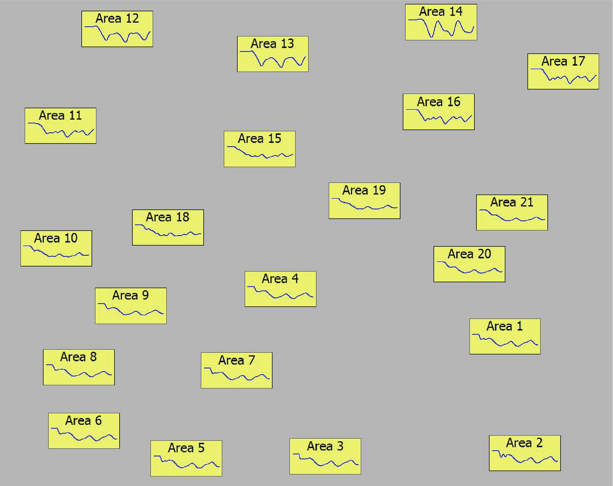
Fig.14 An example of sparklines for area frequency visualization.
An extension of this approach is to change how the data is grouped prior to the sparkline visualization. In the previous example, this was done using the fixed area membership data structure. While certainly useful and intuitive to power engineers, such an approach can miss distinct frequency response patterns that might occur inside a large area, or outlier behavior that might occur at just a few buses. One way to address these possible omissions is to first utilize clustering algorithms to group the buses or generators based on some characteristic, such as their frequency response [28,29]. This method is demonstrated in Figure 15, in which a clustering algorithm is applied to the Figure 5 results, with sparklines used to show the average frequency response for the generators in each cluster. Ten clusters were identified, with sizes ranging from a single generator to more than 1500 generators. The geographic data view approach of Ref. [27] was used to color the generators’ geographically located symbol based on their cluster membership. A sparkline was then used to show the average frequency response for the cluster elements. With this approach, several outlier generators with quite abnormal frequency responses could be rapidly identified. In the example, this abnormal response was ultimately traced to modeling errors, which were later corrected. Originally applied to frequencies, the technique was later extended to bus voltage magnitudes in Ref. [29]. The algorithms are extremely fast even when run on thousands of data points; hence, they could be used for online analysis in tracking mode with PMU measurements.
《Fig. 15》

Fig.15 An example of cluster usage to group transient stability frequency response.
《5. Conclusions》
5. Conclusions
An enormous capital investment has been made in installing equipment to collect data and in building computing infrastructure to store this data. This investment will form the foundation of the electric transmission system smart grid. In order for this investment to ultimately prove useful, this new data will need to be properly used to help operate the electric power system in a more efficient manner. This paper has presented visualization techniques that can utilize this information to help improve both online and planning decision-making. While some of these techniques are not new to the industry, their wider adaptation would prove useful. In addition, the greater availability of additional data sources that the smart grid provides will make visualization more valuable. This paper has also presented sparklines as an important additional visualization tool that can utilize the more granular time-varying nature of the newer measurement devices such as PMUs. As the data available from smart grid sensors continues to expand, wide-area power system visualization will continue to play a crucial role, with a need for continued research and development.
《Acknowledgements》
Acknowledgements
The authors would like to acknowledge the Power Systems Engineering Research Foundation (PSERC) and the US National Science Foundation (1128325) for support that funded part of the work presented here.
《Compliance with ethics guidelines》
Compliance with ethics guidelines
Thomas J. Overbye and James Weber declare that they have no conflict of interest or financial conflicts to disclose.


 京公网安备 11010502051620号